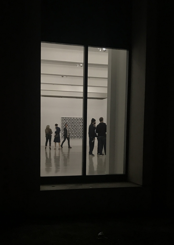
Bridget Riley at Spruth Magers Gallery: Painting Now

riley window

The following is an exciting, in-depth guest post from artist Heather Lowe

“Look at it. Just look at it!”, Bridget Riley exclaims as the light “grew brighter and stronger every minute.” This comes from an introduction to a catalogue of Bridget Riley’s paintings that traveled to the Albers Museum, written by Robert Kudielka. Kudielka, one writer among many great writers who enjoy writing about Riley’s paintings, describes Riley’s intimate and lasting relationship with nature.  Bridget Riley grew up in Cornwall where the sea sparkles and the soft lichen and grass cover the hillsides. At eighteen, she entered Goldsmith’s College School of Art. From 1952-1955 she attended the Royal College of Art in London. In the summer of 1960 she traveled to Italy with Maurice de Sausmarez. At this time, she began her color field studies and we are privileged to see one here in Los Angeles: “Pink Landscape” which was influenced primarily by Seurat. Here we see dots and dashes of color interaction soon to evolve into Riley’s “units” of composition. Riley had already meticulously copied Seurat’s work. She was also moved by the futurists in Italy, including Balla and Boccioni.  Fleeting movement and the element of surprise are also evident in her work.

The exhibit Painting Now at Sprüth Magers is thoughtfully curated and brings Bridget Riley’s paintings to Los Angeles for the first time since the 1970s. The gallery’s press release states that the title comes from a lecture Riley gave at Slade School of Fine Art in 1996. Oh, there have been a few Bridget Riley’s here and there. Cirrus always had a few, MOCA exhibited a painting a while ago (Green and Magenta Diagonal, 1968) and Santa Barbara had one of her black and white artworks from 1960’s last I checked. But we have not seen Riley in L.A. like this ever before. LACMA recognized the importance of this event and held a panel discussion wonderfully moderated by Lynne Cooke. The brilliant Michael Bracewell generously shared his knowledge of Riley’s practice and purpose. Toward the end he mentioned Riley’s element of “joy” and let us know she is currently looking at Constable: his clouds. Her painter assistants were in attendance.

This show has 23 artworks from the 1960s and then hurtles into 2014-2018, with the exception of “Vapour 2.” The show elucidates strong parallels in Riley’s work. As you enter, to the right you see her masterpiece, “Late Morning 1,” 1967. Riley does series of works, as you will find, in all her investigations. This painting is composed of vertical stripes, alternating and varying reds and blues, which compress and relax the white areas so that a kind of morning light emanates from the center through color interaction and after-image. The painting breathes.

heather 1


Also, in this room are three of her “Memories of Horizons.” The stripes are horizontal, painted in primarily warm, hot colors and some cools but overall warm/ hot sensations and they appear to undulate upward and downward. It’s wonderful to have three of these together to compare color movement and rhythm. Memories of Horizons is from a poem by Mallarmé, says Riley, “in which a long stream of consciousness tries to answer the question: what is the world?” These paintings are horizontal and so “Horizontal Vibration,” done in 1961, is placed on the opposite wall and is reflected in the “Memories.” In this very early work, Riley was first discovering how black and white could be modulated, shifted, and displaced to release energy from the painting surface. It recalls the afterglow of a sea surface or desert plain.

heather 3

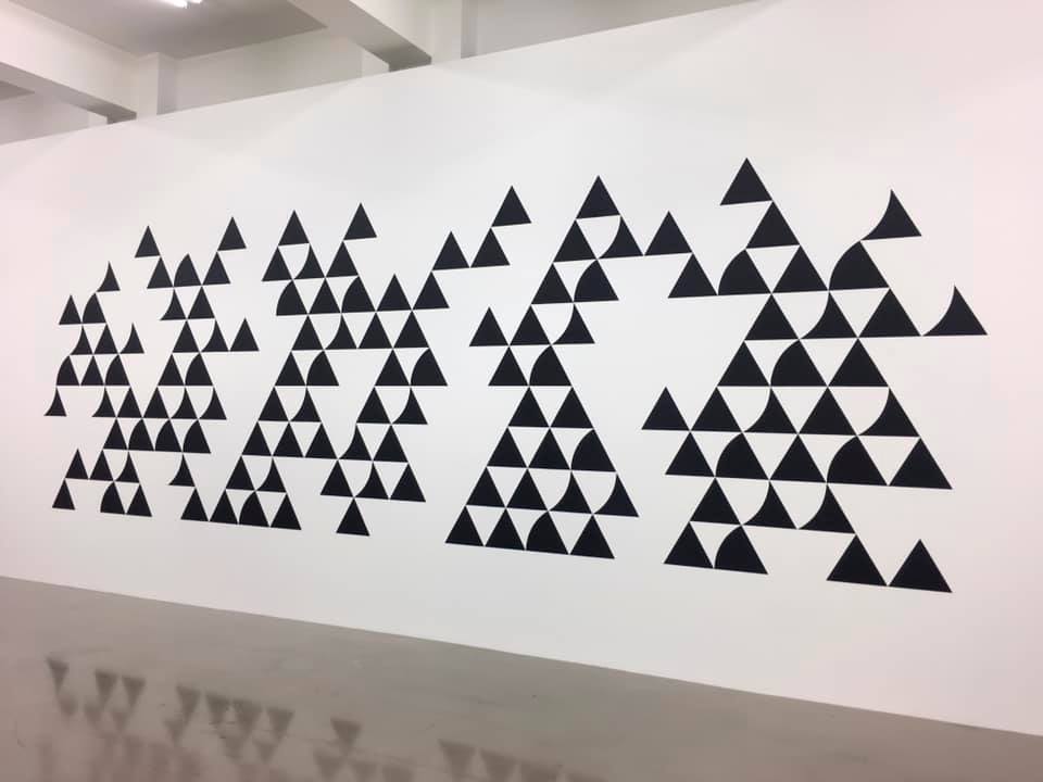
Moving into the next room we get the full reward of her years of intense painting in black and white. The surprise for me was “Quiver 3,” 2014, graphite and acrylic on the wall, about 150 inches in length (above).  In this and “Divertimento,” 2016, acrylic on canvas, reminiscent of her beautiful early painting, “Tremor,” 1962, Riley paints what appear to be very simple units of triangles on a triangular grid but with slight dips and curves carved or added to the sides. In her drawings during this period, one can see the myriad ways she labors to shift the pacing between the units by turning and varying the individual shapes. Levels rise and fall, movement sparkles throughout the surface activating our senses. It’s important to her that the units do not stand out on their own but complete a harmonious unity.

heather2

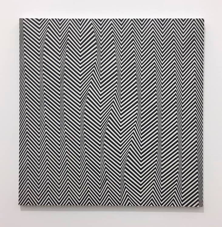
“Descending,” 1965, 36” x 36” (above) absolutely cracks and warps the surface and has many other wonderful color sensations. It was her early black and white painting that shot her name to fame rather violently, as some of you may know, when at the Responsive Eye Exhibition in New York, someone copied her painting “Current” on fabric and put it in a window display.


Later, in an interview with Andrew-Graham-Dixon, Riley describes the opening: “It was astonishing, about half the people there were wearing clothes based on my paintings and I tried to avoid having to talk to the people who were the most completely covered in me. There was one member of the MOMA council who was so furious that he said, ‘So you don’t like it? We’ll have you on the back of every matchbox in Japan!’…” She goes on to say that being in America was wonderful and the artists gave her much support, but it was tough for her to be taken seriously during this time. Since then, of course, she has received many accolades including the first woman to receive the Venice Biennale Major Painting Prize in 1968. Riley has also influenced so many painters through the decades. She and other Op painters working with perception and optical sequences changed the activity of picture plane. It was truly a new way to treat the planer surface. The paintings are visceral in this room so take them in slowly or at a glance.  I believe gallery lights are a tad too bright for artwork in this room and are unnecessary. They are splendid on their own!

Upstairs we are greeted with some of her most recent work: “Measure for Measure.” We have number 23, 24 and 25, square 62-inch compositions and their accompanying smaller studies 25-inch squares. (Yes, there are numbers 1-22 somewhere). She painted a lot of these disc paintings. Also, in this room are two wall paintings with the disc units titled “Cosmos 2,” 2017 and “Untitled 2,” 2017-18. Her Measure for Measure painting series has been exhibited as early as 2016. Using lavender, green and orange at a very light saturation and mid-value, circles are painted in a grid in different compressions, sometimes tight, sometimes loose, sometimes discs go missing and the color sequences vary as well. They are calm and quite a contrast from the black and white paintings. The key to these it seems is what happens to the white areas which the colors live in: color irradiation. The white areas surrounding the discs have color after-effects, to be sure. There is also a kind of inner light that the discs seem to throw upon one another due to color contrast and interaction. I found these soothing but unpredictable. The “Untitled 2” is more minimal and daring. Very beautiful vector after-images set up and the open field is there. Riley has made use of discs in her early work when she started to introduce greys into her paintings. Riley has stated in several interviews that she is not concerned with the shape as signifying something.  Also, she is interested in color-form, not colored forms. Two treasures from this early work are in the show: “Black to White Discs,” 70” square and “Study for Black to White Discs,” 35” square. In these paintings one can see Riley’s exquisite workmanship. The orientation of the composition is diamond shaped and the graduated tonal sequence of the discs move slowly across picture plane. I had to convince a gentleman that, yes, indeed they are painted. They are not prints.

Bridget-Riley-Pink-Landscape

And we come full circle to her “Pink Landscape” painted in 1960 beside a really lovely “Vapour 2,” a striped painting done in 2009 which, coincidentally, has the same color combination as the disc paintings. Alas, we do not have any paintings from the late 80s and 90s: her Egyptian palette. I love those. But it’s an excellent show. Bridget Riley works toward nature. She paints intuitively. Her compositions have developed through her experienced and responsive eye. In her own words: “As a child one plays by lying on one’s back and filling one’s sight with the blue of the sky only to find the blue goes slowly towards grey. Your own eye produced the after-image of yellow-orange to compensate for the intensity of the blue. Color relationships in painting depend on the interactive character of colour; this is its essential nature.”

Go see it! Learn something.

The exhibition will be up Nov. 16, 2018 – Jan 26, 2019

Bridget Riley: Flashback, Hayward Publishing, 2009

Bridget Riley, Paintings 1982-1992, Introduction by Robert Kudielka, Printed in Germany, 1992

Bridget Riley by Maurice de Sausmarez, Studio Vista Limited, Great Britain, 1970

Bridget Riley, Dialogues on Art, Philip Wilson Publishers, London, 1995

Bridget Riley, Financial Times, Nov. 8, 2018

  •    Feature by Heather Lowe, Photos:  Jennifer Faist Hill

SoFlo Video Production Studio: Why Standing Sets Make Sense

grafitti

Musical artists and bands, filmmakers, producers, and videographers take note: SoFlo, a video production company in Florida is reaching out about their easily available standing sets. Having worked with and written about many indie filmmakers, it’s an interesting concept: sets that are available for controlled production aesthetics at a reasonable rate.

As a rule, most indie filmmakers and musicians use as “sets” the street, a home, or a business they’ve cajoled into allowing them to film there. Often they do this for verisimilitude, but equally often they do so because sets are out of line with their budget.

According to film producer and manager Kim Brown, “In-studio sets are much simpler and cleaner to work on. The problem for many filmmakers outside the studio system is how much it costs to rent a studio space, and then frankly, you’re usually dressing a studio yourself. By the time you’ve done that, the costs really add up. So, you usually go with just hit or miss location scouting, and make do.”

She adds “The quiet, space, and privacy of a studio set would be great, but in most cases it’s simply out of line with what filmmakers can afford.”

SoFlo is something different: the company offers standing sets as well as every prop that you would expect to be in the scene, and lighting equipment – in a controlled and comfortable shooting environment that’s directly aimed at independent film makers, bands, music video directors and the like.
interrogation-768x419

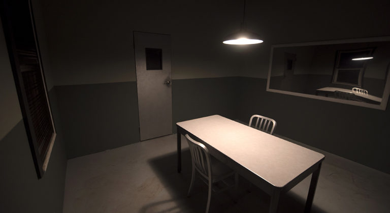
We took a Skype-tour of the sets and were impressed. The Sunrise, Fla. company has an interrogation room with a two-way mirror; a hospital room that could also be used as a doctor’s office – having finagled my way into doctor’s offices and empty hospital beds for shoots long past, this one looked particularly valuable to me; and a locker room, prison cell, and padded cell among its sets.
drset

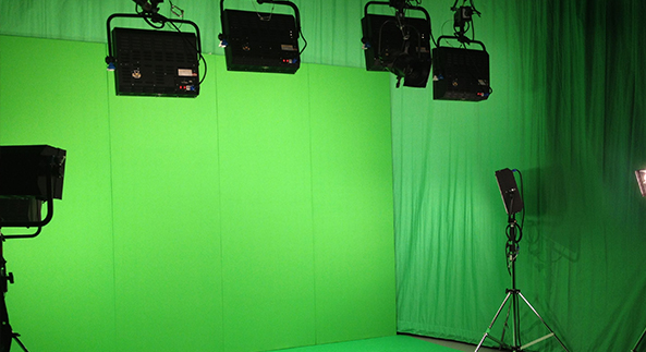
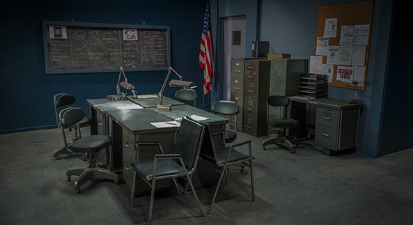
One of the most detailed sets is the company’s police station, that comes with a full prop set, just ready for the guys and gals in blue to show up. And once they’ve locked up the perp? There’s a prison studio set, too. With a highly detailed, old-school classroom set, a fairly elaborate hotel lobby, and a graffiti-covered hallway, the company has plenty of options. And they also have a green screen room, which means you can be anywhere you want to be just about seamlessly.

policestationsmall

Outside the in-house stage sets, SoFlo also owns their own nightclub and restaurant filming location for an authentic look in a controlled environment.

lounge

And then there’s the lighting. As well as being provided in the studio set of a filmmaker’s choice, it’s also deliverable off-site. Set or no set, the company also has a robust prop list available for filmmakers to rent, as well – exotic cars, too.

i5

“When you add in downtime and re-shoots at random locations due to noise or lighting changes, the cost of permits, transporting gear, and the comfort of the actors, having a studio set option like this available is a great choice,” Brown says.

  • Genie Davis; Photos courtesy of SoFlo


Feasting on Fish: Awesome Entrees at Killer Shrimp

46518823_10215978697807479_3560780874842636288_n

With a gorgeous harbor view, spacious seating on the patio, comfortable inside booths, and seafood entrees that live up to the name “killer,” Marina Del Rey’s Killer Shrimp is a delight.

46727334_10215978698047485_970159006800674816_n

37585418_10156565555387774_5397238706551652352_o

46520277_10215978698247490_2558841940435009536_n

Best known for their spicy peal n’ eat shrimp, there’s plenty more on the menu to feast on.

37629816_10156568463367774_8539749295010611200_n

We started with a crisp SLO Brew IPA and a classic cocktail, Pieces of Eight. A revamp of a classic Tiki drink from the 60s that originated in MDR, the flavor-rich mix of housemade passion fruit syrup, fresh pineapple and lime, and Cruzan rum was served in a super fun Tiki glass and garnished with a pineapple leaf.

46526098_10215978101592574_4188566756916199424_n

Appetizers made a perfect start for our meal. The shrimp cocktail was more than ample to share, with tail-on large shrimp ringing the serving and a mix of the same fresh and delicious shrimp chopped with cucumber heaped inside the bowl. The sauce was zesty without being spicy or overwhelming the flavor of the shrimp.

46521195_10215978101872581_4656356543048974336_n

We also tried the Ahi Tuna Poke Tacos. Again, the freshness of the poke was terrific, and the crisp, puffy, house-made taco shells nicely contrasted with the silky fish. The tacos were topped with a creamy avocado mousse in an artful presentation.

46935112_10215978102072586_1140016231688962048_n

As entrees, we enjoyed two very different selections. The Killer Paella was a rich and satisfying dish with a hint of the exotic. Saffron rice,  andouille sausage, chicken, clams, mussels, calamari, and shrimp were bathed in a spicy flavor that accentuated the more delicate saffron. The Blackened Salmon Filet was tender and moist, an ample filet crisp with seasoning that enhanced but did not overwhelm the fish. The filet was centered over a puree of maple-scented brown butter sweet potatoes and wilted spinach that made a pretty magical combination.


46767532_10215978668206739_3061152513324482560_n

The menu also features sandwiches and bowls – the lobster roll served at the next table looked pretty wonderful. Meat dishes such a filet mignon, and pasta choices like lobster ravioli, rounded out a menu that was full of pescatarian choices that encouraged us to plan a return for a taste – perhaps jumbo coconut crusted shrimp or the Fisherman’s Stew in a spiced tomato sauce.

44306326_10156782044082774_3703634111332614144_n

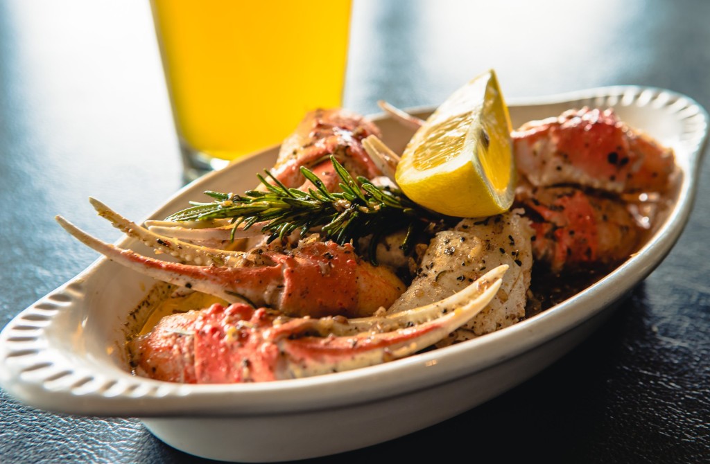
And naturally, the restaurant’s signature peel n’ eat shrimp is available in a zesty, spicy simmer in a variety of permutations that include the original, a shelled choice, with pasta, and a mix of shrimp, lobster, and crab with sweet corn.

A variety of tasty sides also are offered, from a “loaded” baked potato to fries, broccoli, and asparagus.

41647180_10156699040232774_573102251086708736_o

Desserts – which we were too full to sample – include a sweet potato pecan pie and a Guiness Chocolate Bread Pudding, as well as giant, warm, fresh-baked chocolate chip cookies or brownies.

46751221_10215978697327467_4462032985419415552_n

And for those of you hankering for delicious fish 24/7, the adjoining Killer Shrimp Cafe can provide just that, and is even open on Christmas.

45779671_10156838096902774_6621827431323926528_n

In short: Killer Shrimp isn’t all about spicy shrimp, although that’s pretty terrific, too. It’s about beautiful seafood served with a “killer” marina view, friendly and knowledgeable service, and best of all – a wide variety of entrees with choices sure to please any palette. Keep it casual or make it elegant, seafood here is quite a “catch.”

  • Genie Davis; tasting/dining room photos: Genie Davis; additional photos: courtesy of Killer Shrimp 

Shades of Water is Liquid Beauty at the Montalban


QgWp1EwA

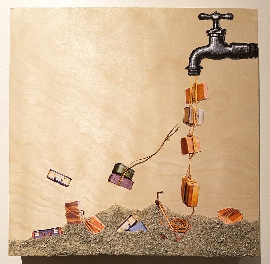
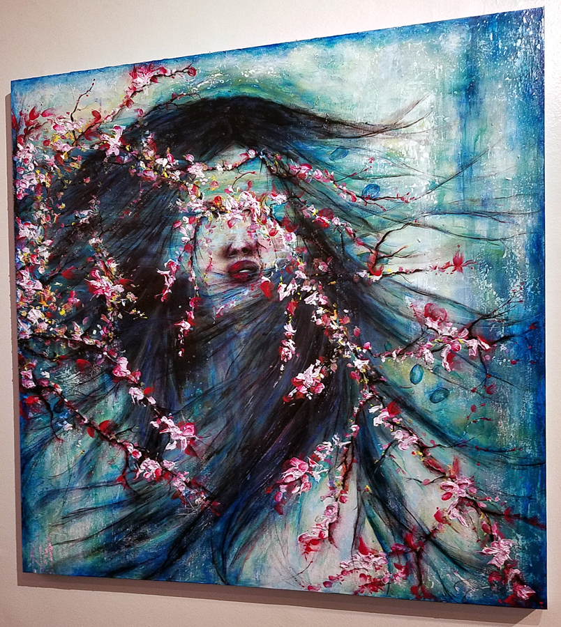
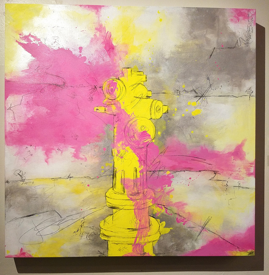
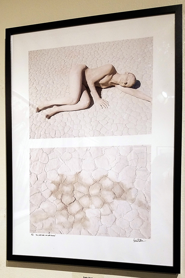
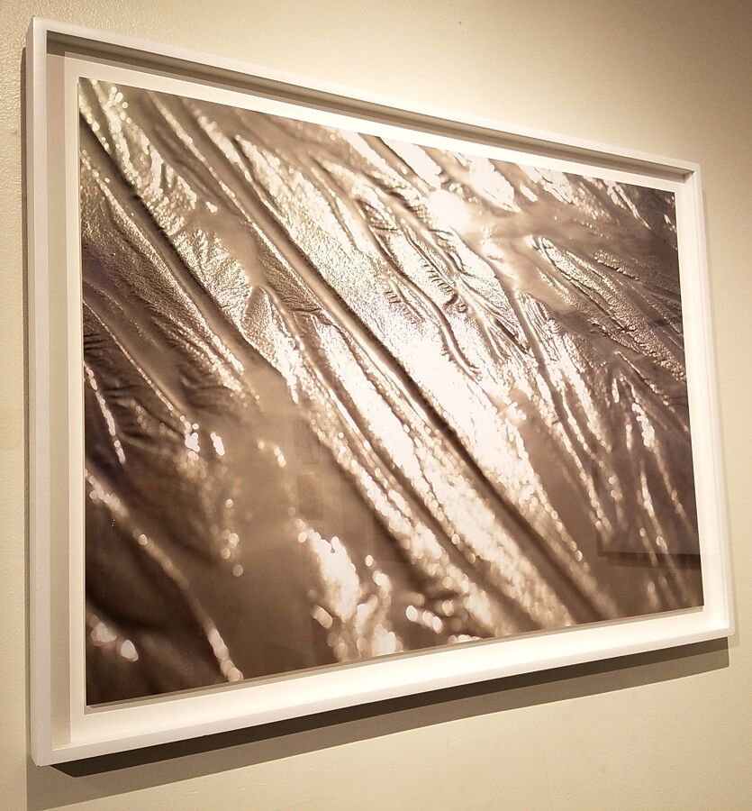
At the Montalban Mezz Gallery through January 31st, Shades of Water, curated by Baha H. Danesh is both liquid lovliness and a highly prescient exhibition that underscores the urgency of modern environmental challenges from climate change to pollution of our oceans.

The exhibition, presented by We Choose Art, includes paintings, sculpture, photography, fiber work, and installation art.

20181116_202514

20181116_202430

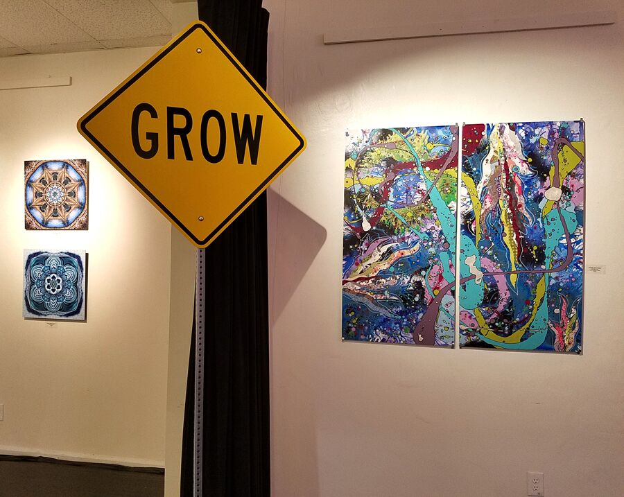
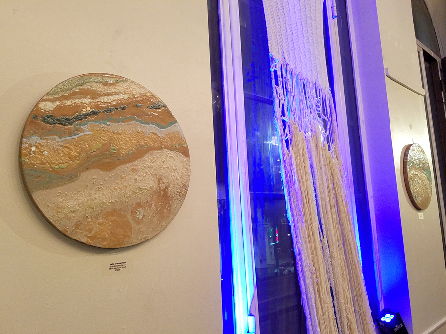
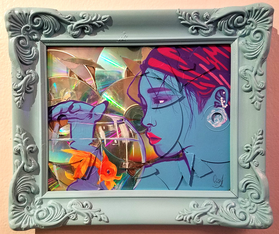
The group show documents images of water and its importance, expanding upon and encouraging conversation on both climate change and sustainable energy. Featured artists include Amabelle Aguiluz, Barbara A. Thomason, CanLove, Chenhung Chen, Daggi Wallace, Eric Minh Swenson, Felís Stella, Joan Scheibel, Joelle Cooperrider, Karen Hochman Brown, Kellie Walker, Kristine Schomaker, Margaret Hyde, Rebecca Laws, Scott Froschauer, Susan Poms Amorde, and Winston M. Secrest.

pP8Rhq0Q

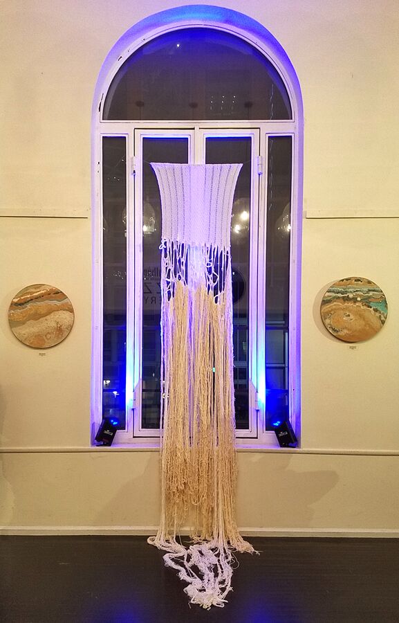
Featured works include Joan Scheibel’s contemporary abstracts, the contemporary realism of pastel artist Daggi Wallace, and the delightful sculptural work of Scott Froschauer. Chenhung Chen’s found and mixed media sculptures and wall art are a delicate yet visceral standout. Her copper wire work is as delicate and ephemeral as waves in the wind.

IdUj62CA

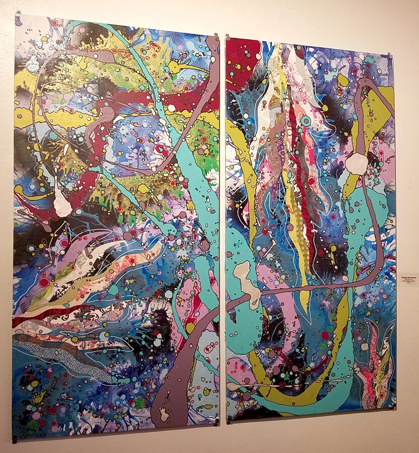
Working in video and photography, Eric Minh Swenson’s art seeks to immerse viewers in powerful images.  Kristine Schomaker displays lush abstract painting that takes on the shapes and sinuous quality of water droplets and mysterious pools.

nLb0GnhQ

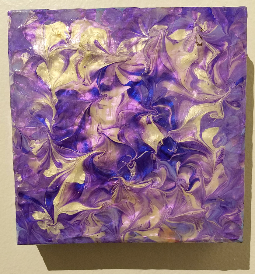
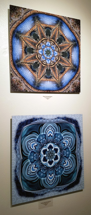
Mixed media work from Susan Poms Amorde and the swirling kaleidoscopic patterns of Karen Hochman Brown add fresh dimensions to the topic.

20181116_200029

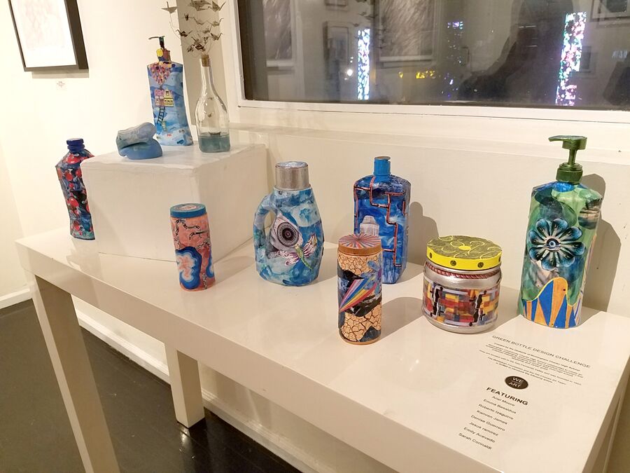
Also on display are the clever and cool eco-friendly art by the students of Birmingham Community Charter High School in Van Nuys, displaying their entries in the Green Bottle Design Challenge.

RaRUFI2Q

The collaborative community of We Choose Art has once again offered a vibrant exhibition infused with the spirit of activism. Come thirsty for art, and drink deep.

pNkfgFRQ

20181116_205835

20181116_202456

20181116_202521

20181116_202338

20181116_200004

  • Genie Davis; Photos: Kristine Schomaker