Earth & Ember – An Exciting Mini-Survey at CSULA

Southern California in the 1950s- 1960s was ground zero for what became a revolution in ceramics, moving clay away from a strictly functional or decorative medium towards experimental, abstracted sculptural forms that pushed clay from a craft designation to a fine art one. At the helm of this mainly macho movement was the energetic, charismatic Peter Voulkos, who came to ceramics accidentally, after being required to take a ceramic course for his painting degree. Reluctant at first, he immediately fell passionately in love with the versatile, malleable material that is clay. As a popular teacher at Otis, he treated his students as colleagues, threw out any curriculum and encouraged individuality from students John Mason, Ken Price and Ron Nagle – who got rejected from the program but was hired as an assistant anyway, and created a hotbed of artistic activity.

Earth & Ember brings together iconic work by many of the luminaries who contributed to this fertile time in ceramic history and whose work is in the canon. More importantly, this exhibition is really a paean to the teaching artists of the University of California at Berkeley and UCLA, University of Southern California, Otis College of Art and Design, and Chouinard Art Institute.

The show is also tribute to the homegrown ceramics program of California State University, Los Angeles whose alumni’s works are included in the exhibition. It’s a story of affinity and inspiration, starting with Pablo Picasso, who in 1947 began working in clay and created more than 3,500 painted ceramic objects profoundly influencing Peter Voulkos himself.

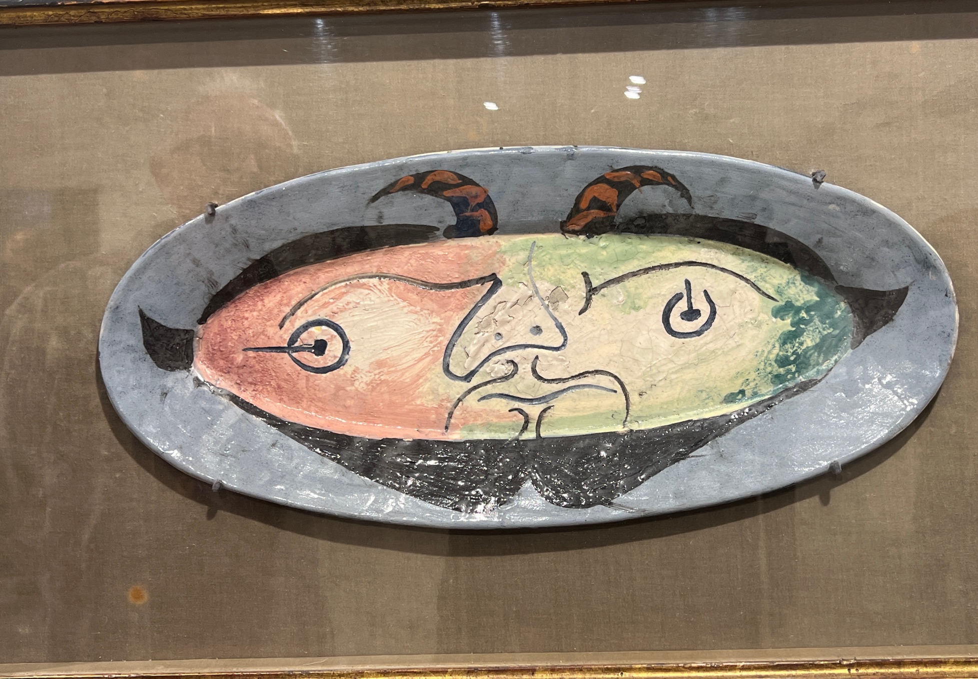
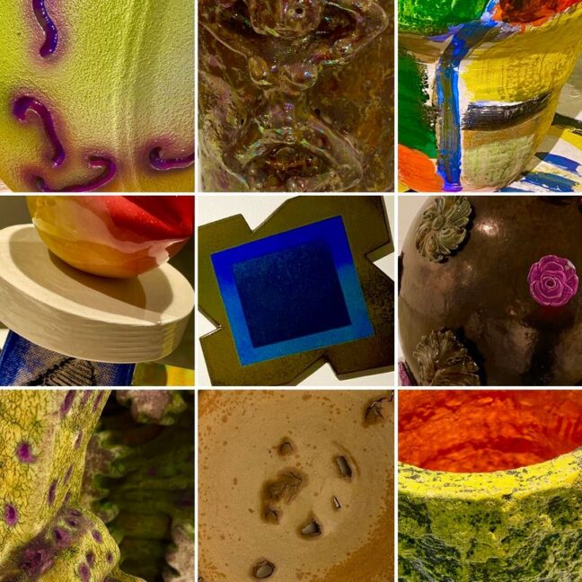
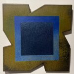
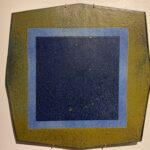
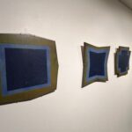
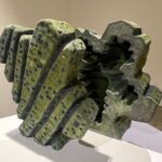
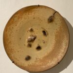
Picasso’s 1948 ceramic plate “Head Of Faun” (Courtesy of Frederick R. Weisman Art Foundation), which is the centerpiece of this exhibit, is a lovely oval platter with Picasso’s hallmark jaunty and expressive line. The plate is embedded in a frame as if it were a painting, playing once more with the blurring of two and three dimensions. Nearby is one of Voulkos’s glazed porcelain plates from 1973, where he characteristically pokes holes and leaves imprints on the wet clay, clearly announcing that this is not a functional plate. John Mason, who at one time designed dinnerware but who is primarily known for his large-scale ceramic sculptures, is represented by a gorgeous series of slab plates, each with a unique geometric edge. The series of “Untitled Relief Plates, #183-186” (2008), seems to reference color field painting and shaped canvases of the 1960s-70s.

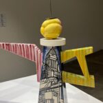
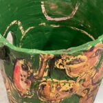
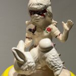
Beatrice Wood was one of the few women admitted into the all-boys club and her lusterware vessel “Dancing Ladies” (1982) is intentionally paired with Randall Bruce, who generously loaned the Wood piece from his private collection. Bruce’s “Double Bucket” from 2006 is a combination of wheel thrown and hand-built pieces, lovingly glazed with a metallic glaze. These two works are in conversation about form, function, and mystery. The pairing of Peter Shire’s meticulous whimsical, low-fire, hand- built sculptures alongside Roger Herman’s large scale, wobbly, abstract-expressionist vessels and table, are brilliant. Where Shire uses an underglaze pencil to carefully draw on the flat slab teapot piece entitled “Fallen Idol” (2005), Herman pours and brushes glazes on his vessels “Frog” (2023) and “Untitled” (2020), allowing the glazes to coagulate, run and even flake off. Shire is a multidisciplinary artist whose ceramics and furniture all incorporate the bright colors, jazzy patterns, and geometric shapes of the Italian design group Memphis. Herman, most well known as a neo-expressionist painter before turning to ceramics uses this technique to charming effect.

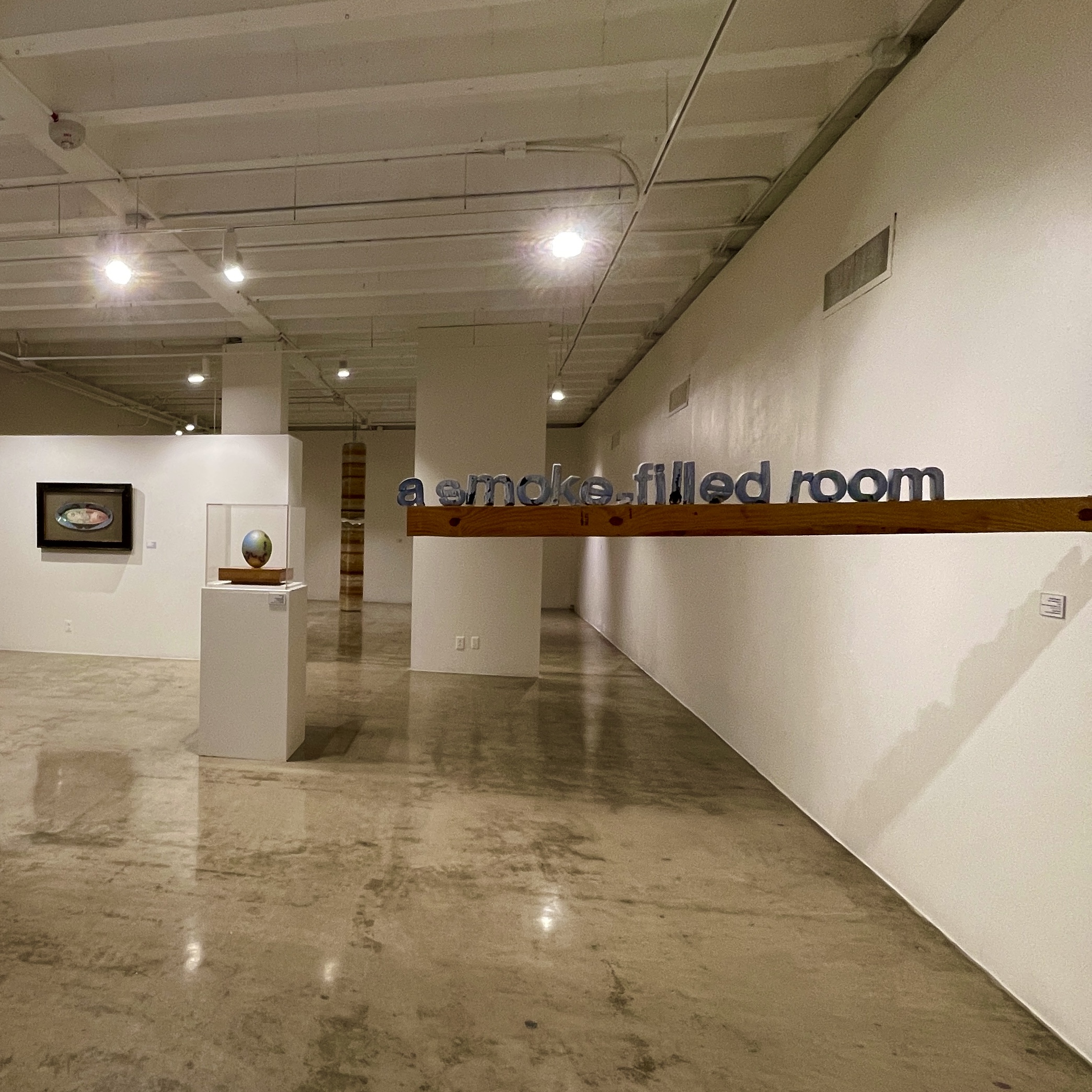
Thomas Muller’s “a smoke-filled room” from 2017 is a witty conceptual text- based piece, cracked and peeling, and alluding to power brokers who meet in back rooms. The phrase originated in 1920 to describe the process in the Republican National convention nominating Warren G. Harding for president. And of course, clay is also fired – though hopefully not in a smoke -filled room, though the process of Raku firing relies on smoke to create beautiful and accidental surface effects.

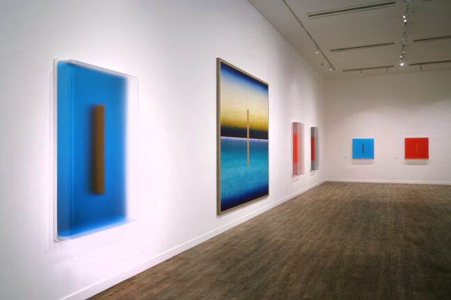
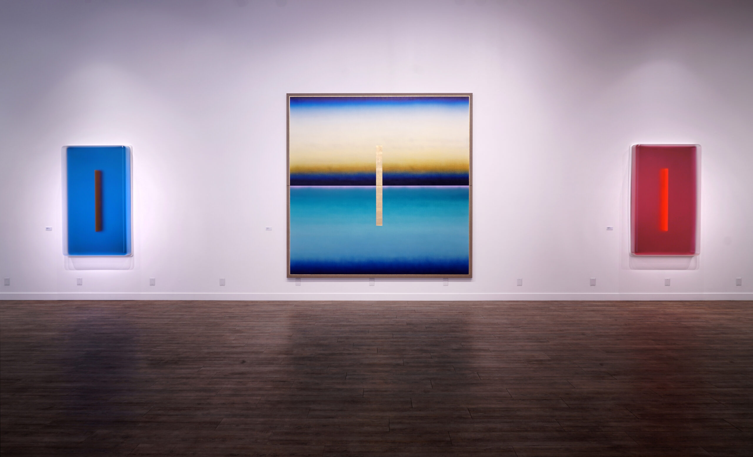
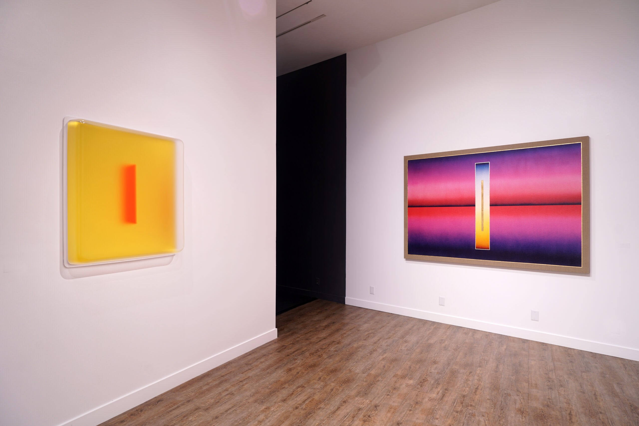
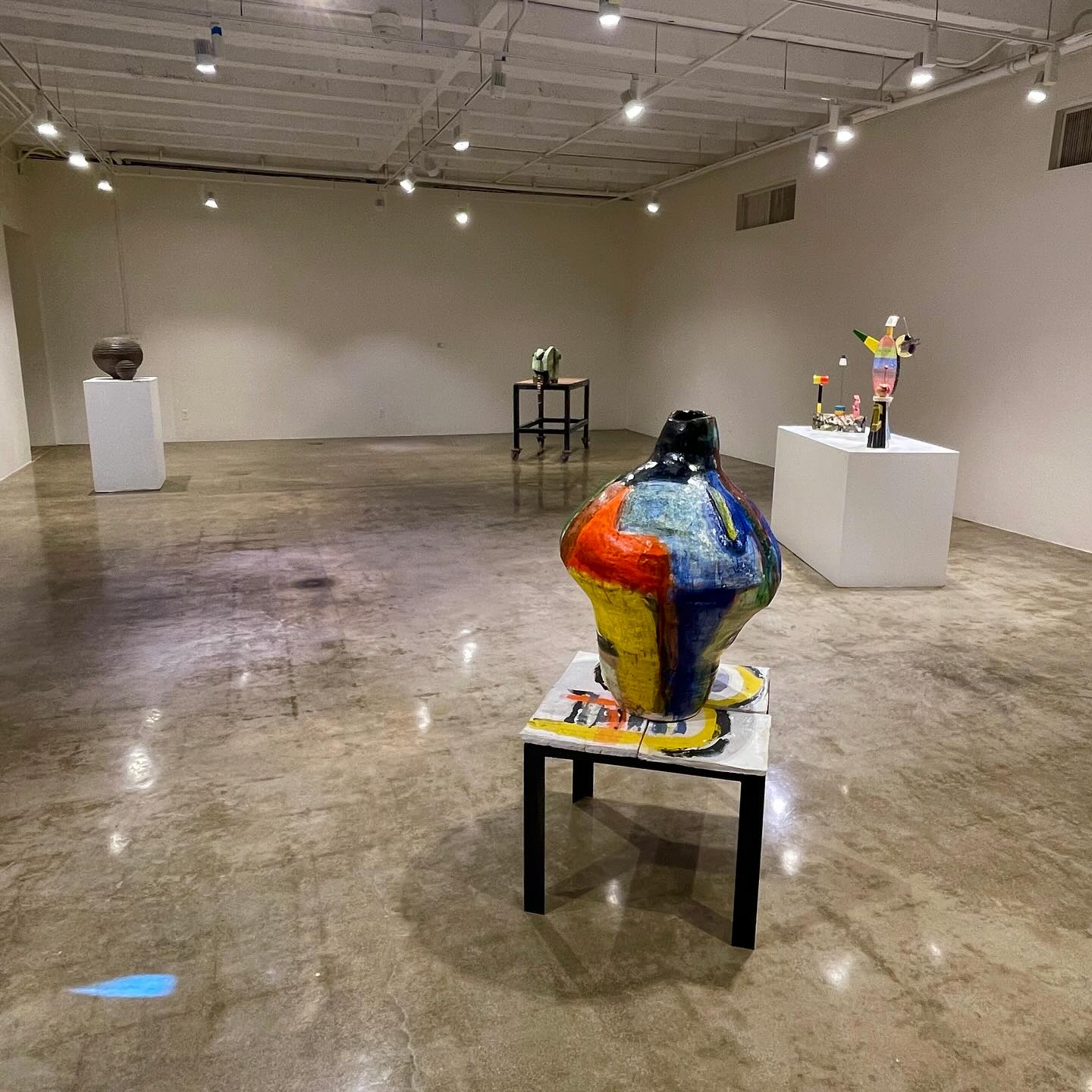
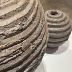
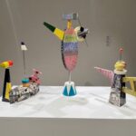
The variety and complexity of the techniques exhibited here is staggering, from wheel thrown to slab construction, slip cast assemblages and a combination of wheel thrown and hand-built: the clay and glazes range from secret formulas to commercial ready-made glazes to automotive paint and the clay bodies from low fire to high fire to locally harvested clay. There are too many outstanding pieces, too many compelling ideas explored here to discuss them all.

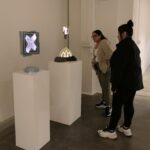
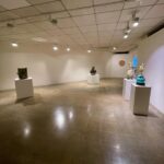
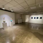
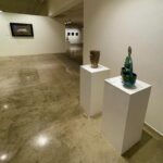
It’s a great chance to see a wide variety of approaches and works from the intimate to the grand in scale. This is a mini survey show and like a delightful appetizer leaves the viewer wanting more.

Earth and Ember: Ceramic Exhibition
January 22- February 22, 2024
Ronald H. Silverman Fine Arts Gallery
Cal State LA

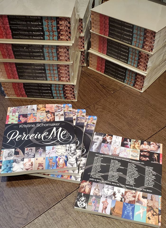
  • Nancy Kay Turner; photos: Nancy Kay Turner and as provided by the gallery 


Casper Brindle Radiates Light and Color at Luckman Fine Arts Complex

If you were to pass from our universe to the next in a sudden flash of light and time, perhaps undergoing this passage through a wormhole, a dream state, or as they used to say on the bridge of the starship Enterprise, at “warp speed,”  you might emerge transcendent, with a strange glow suffusing your vision. Such is the experience of viewing Casper Brindle’s mysteriously sensory art.

In a bravura exhibition at the Luckman Fine Arts Complex at CSULA, curated by Mika Cho, Brindle’s own passage through time, light, and space was on full and radiant display. Ranging from some works earlier in the artist’s career to a full focus on images created in 2021 and largely in 2022, Hypermodality provided a beautifully complete experience of Brindle’s work.

Dimensional images that pulse with color and light and play with perception are the core of Brindle’s work. His aesthetic moves the eye and the mind, vibrating with barely contained motion, hovering like a UFO just outside our peripheral vision. Both galvanizing and meditative, varying in color from vibrant shades to cloud like monochromatic shadows of varying hues, these works create emotional and cognitive leaps for viewers, bounding between shades and shadows, running into the sharp edges of horizon lines or disappearing like the taillights of an interstellar ship traveling an incomprehensible speed into a thick, floating tube.

Beautifully curated across two connected, open, large gallery spaces, wandering through the Hypermodality exhibition, which closed at the Luckman in November, was like floating on a life raft of light. Seeing these images in this serene space, it was possible to take in both the meticulously applied airbrushed layers of paint, the hypnotic quality of Brindle’s use of gradated color and shadow, and the enigmatic glow of the art.

The artist’s most recent work is so luminous that it appears to use external lighting, while in reality using color and texture to create an aura of soft, regenerative light.

Some works seem to bathe the viewer in bioluminescence, pulling the eye into a softly opaque sea or into the center of a soft cloud. Just as a bioluminescent sea shines when disturbed by a breaking wave, these works shimmer as the viewer moves closer or farther from them, whether they are viewed from the side or the center.

Other paintings recall the opalescent glow of a pearl, or the shifting colors and light flares of a fire opal. Indeed, each of these works could be pulled from the sea or the sky, or within a long-buried geode, cracked by time to reveal the shining gems within.

Uniformly, Brindle’s work is a perfect haiku of light, as well as an epic study of how color contains or expresses that light. Each piece tells a story of transformation, of how our vision of the world changes that world; how our eye creates the place in which our hearts and minds dwell, not just geographically but emotionally.

All this in works that are formal and made with careful attention to line, geometric principles, and a cool intensity of mannered shapes and patterns.

With titles that describe light glyphs and portals, it is no wonder that Brindle’s art evokes time travel, the speed of light, powerful entities and spiritual understandings, worlds that exist within or beyond our own comprehension.

An almost-holy simplicity infuses each work, whether created from pigmented formed acrylic or with layered automotive paint and gold leaf on linen. The impressiveness of Brindle’s technique rests in its quiet power, much as does the beauty of a sunset or the flare of a meteor. His art burns with the fire of color, and yet has an icy perfection that evokes a glass prism, capturing color and encapsulating it, allowing it to shift but not fade to black.

Some of the colors are startling: “Light Glyph VF 11” is the fierce cerulean blue of the hydrothermal Sapphire Pool in Yellowstone Natural Park. “Light Glyph VF 13” is the luscious tangerine of a citrus fruit on acid. Just as startling is the softly opalescent gold – with a layered burnt sienna orange bar at the center, or “Light Glyph VF 8.” The artist’s “Light Glyph VF 23” is no less riveting, an orange sun or a work with a softer, blurred orange bar at its center.

While each of these works are created using thick pigmented acrylic, Brindle’s works on linen are no less startling and rich, just differently textured. “Portal Glyph Painting X,” a massive 120 x 120 work using gold leaf and automotive paint on linen is an aqua sea and gilded sunrise with a glowing gold door cracked open just enough to see and allow passage if we dare.

A pair of sensual curves in hot pink wait succulently behind a wider passage in “Portal Glyph Painting III.” In this work, a radiant, slender rectangle of blue and gold light features a dark gold bar at its center, a portal within a portal, perhaps.

Regardless of format, Brindle’s work is above all else alive. It is alive with light, alive with line, holding within its serene and pristine depths a seething, swimming, sensorial swarm of color. If the images deliberately create a sense of the possibility of passage, or entering an “other” realm or experience, then that passage is as the viewer wishes to shape it, leading where the viewer wishes to enter. The artist offers the portal to enter, or the light to step through, but it is up to the viewer to take that step.

One of the finest exhibitions of 2022, Hypermodality commands viewers to take action, to truly see what lies beneath the surface of art, and perhaps, life itself.

– Genie Davis; photos by Rob Brander provided by Luckman Gallery/Mika Cho; additional photos, Genie Davis

Perceive This

Kristine Schomaker had an idea. It started with the personal and has become a galvanizing collaborative project that reaches and speaks to a wide-range of viewers. It’s a conversation starter, it’s a collection of absolutely unique artworks, it’s an exultant vision of personal spirit, a creation from and of the soul that’s grounded – both literally and figuratively – by the body that holds it.

Art above by Sheli Silverio.

We’re talking about Perceive Me, an exhibition about to debut on January 25th at California State University Los Angeles.

Artist: Emily Wiseman

According to Schomaker – artist, curator, publisher and founder of Shoebox PR – the concept for the show started with a conversation between herself and artist Amanda Mears. Mears was drawing Schomaker athe time. “We were talking about body image, ideas of beauty, modeling nude, and I brought up the story that I had only been asked out on a date a couple times in my 46 years of life. I think unconsciously I took that as this validation that I wasn’t worth anything. Of course I know it is much more complicated than that,” Schomaker laughs, noting that the first time she expressed this out loud was in a previous interview for DiversionsLA.

Artist: Holly Boruck

Describing the idea as having come “full circle,” Schomaker says “I never realized that that was where a lot of myself worth came from. The need for outside validation. Or the idea that we often take our own self-worth from how we imagine others perceive us. Working with Amanda and looking back to a collaboration I did with J Michael Walker for his Bodies Mapping Time project as well as Chris Blevins-Morrison for a photographic project, I thought it would be an interesting ‘research project’ to see how I look through another person’s eyes. It was like a lightbulb.”

Artist: Austin Young

Over the next several months, Schomaker put together the idea of how Perceive Me would work, meeting with 57 different artists between November 2018-August 2019.

Schomaker selected the artists for the exhibition beginning with artists she knew who created work using a figure. “I have a folder on my computer of ‘Artists to Watch’ and culled from that. Plus, I looked at my walls, my art collection and invited those artists. And I invited friends, of course. I started off with the idea of 20 artists, then it went to 40; because I couldn’t say no then it went to 60. Most of the artists were invited, but there were a few who contacted me and after looking at their websites and seeing how their art practice was aligned with mine, I knew they were a perfect fit.”

What she mosts want viewers to take from this powerful and poignant exhibition is to “feel free to be themselves. I want people to be less afraid of ‘going for it,’ whatever that means for them. I want people to not be afraid to be different, unique, authentic and to not hide from others or themselves.”

Artist: Geneva Costa

The catalog that accompanies the exhibition is beautiful and rich; delving much deeper into both the intent behind it and presenting a fuller depiction of the images that most exhibition catalogs.

What led Schomaker to create such a vital piece of the project, or as she calls it, performance, is based on a fundamental belief in its social practice/impact and community engagement.

Artist: Marjorie Salvaterra

“I think my thesis was to see if my perception of myself changed as I saw myself through others’ eyes. Or maybe by inviting the many talented artists to collaborate with me, I thought they could make me beautiful? I am just now at this moment asking this question. This is just one project in many in my art practice that will continue helping me develop my own identity.”

Artist: Sydney Walters

“I have a story to tell, a message to relay. I want to educate and inspire. I knew an exhibition would not be enough to get the message out there. I knew a catalog would help get the word out there more,” she relates. “We are also doing artists talks; I am working with classes at the colleges, and there will be a video. I want to support others as much as I can. The catalog was one way of sharing the artists’ amazing work.”

Artist: Dani Dodge

Schomaker terms the exhibition a continuation of her own work, which focuses on challenging and finding herself. “I don’t think I will ever get to an end-point, because life changes all the time. Our identity changes all the time. Our weight changes all the time. My art practice is about telling my story of my eating disorder, struggles with weight and self-confidence. So, it will continue on.”

Artist: Nurit Avesar

The genuinely brave and beautiful show is uniquely notable from its lush and individually terrific images to the concept and Schomaker’s willingness to literally and figuratively expose herself. Following its debut at CSULA, the show will travel to Oxnard College in November 2020, Coastline Community College in January 2021, Mesa Community College in San Diego in March 2021, MOAH in Lancaster in October 2021 and the College of the Sequoias in Visalia in 2022.

Artist: Anna Stump

“We are actively sending out proposals to colleges and Universities right now, because I believe that is where a large part of our audience is. If I can reach our youth and make a difference, I feel like there is hope for the future,” Schomaker asserts.

Artist: Bradford Salamon

Perceive Me opens January 25th  5-8 p.m. at the Ronald H Silverman Fine Arts Gallery, Cal State University LA, under the direction of Dr. Mika Cho.

Participating artists include: Amanda Mears, Anna Kostanian, Anna Stump, Ashley Bravin, Austin Young, Baha Danesh, Betzi Stein, Bibi Davidson, Bradford J Salamon, Caron G Rand, Carson Grubaugh, Catherine Ruane, Chris Blevins-Morrison, Christina Ramos, Cynda Valle, Daena Title, Daggi Wallace, Dani Dodge, Debbie Korbel, Debby/Larry Kline, Debe Arlook, Diane Cockerill, Donna Bates, Elizabeth Tobias, Ellen Friedlander, Emily Wiseman, Geneva Costa, Holly Boruck, J Michael Walker, Jane Szabo, Janet Milhomme, Jeffrey Sklan, Jesse Standlea, John Waiblinger, Jorin Bossen, K Ryan Henisey, Karen Hochman Brown, Kate Kelton, Kate Savage, Kerri Sabine-Wolf, Kim Kimbro, L Aviva Diamond, Leslie Lanxinger, Mara Zaslove, Marjorie Salvaterra, Martin Cox, Monica Sandoval, Nancy Kay Turner, Nurit Avesar, Phung Huynh, Rakeem Cunningham, Serena Potter, Sheli Silverio, Susan Amorde, Susan T. Kurland, Sydney Walters, Tanya Ragir, Tony Pinto, Vicki Walsh.

CSULA Gallery is located at:
5151 State University Drive
Los Angeles CA 90032
Opening Reception: Saturday January 25, 5-8pm

Artist Talk with Alexandra Grant Sun February 2, 2-4pm
Artist Talk with Leslie Labowitz-Starus Sun February 16, 2-4pm
Artist Panel and Closing Reception Sat February 22, 2-4pm

Artist: Daena Title
Artist: Mara Zaslove
  • Writer: Genie Davis; photos: provided by artists through Kristine Schomaker