The following is an exciting, in-depth guest post from artist Heather Lowe
“Look at it. Just look at it!”, Bridget Riley exclaims as the light “grew brighter and stronger every minute.” This comes from an introduction to a catalogue of Bridget Riley’s paintings that traveled to the Albers Museum, written by Robert Kudielka. Kudielka, one writer among many great writers who enjoy writing about Riley’s paintings, describes Riley’s intimate and lasting relationship with nature. Bridget Riley grew up in Cornwall where the sea sparkles and the soft lichen and grass cover the hillsides. At eighteen, she entered Goldsmith’s College School of Art. From 1952-1955 she attended the Royal College of Art in London. In the summer of 1960 she traveled to Italy with Maurice de Sausmarez. At this time, she began her color field studies and we are privileged to see one here in Los Angeles: “Pink Landscape” which was influenced primarily by Seurat. Here we see dots and dashes of color interaction soon to evolve into Riley’s “units” of composition. Riley had already meticulously copied Seurat’s work. She was also moved by the futurists in Italy, including Balla and Boccioni. Fleeting movement and the element of surprise are also evident in her work.
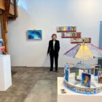
The exhibit Painting Now at Sprüth Magers is thoughtfully curated and brings Bridget Riley’s paintings to Los Angeles for the first time since the 1970s. The gallery’s press release states that the title comes from a lecture Riley gave at Slade School of Fine Art in 1996. Oh, there have been a few Bridget Riley’s here and there. Cirrus always had a few, MOCA exhibited a painting a while ago (Green and Magenta Diagonal, 1968) and Santa Barbara had one of her black and white artworks from 1960’s last I checked. But we have not seen Riley in L.A. like this ever before. LACMA recognized the importance of this event and held a panel discussion wonderfully moderated by Lynne Cooke. The brilliant Michael Bracewell generously shared his knowledge of Riley’s practice and purpose. Toward the end he mentioned Riley’s element of “joy” and let us know she is currently looking at Constable: his clouds. Her painter assistants were in attendance.
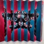
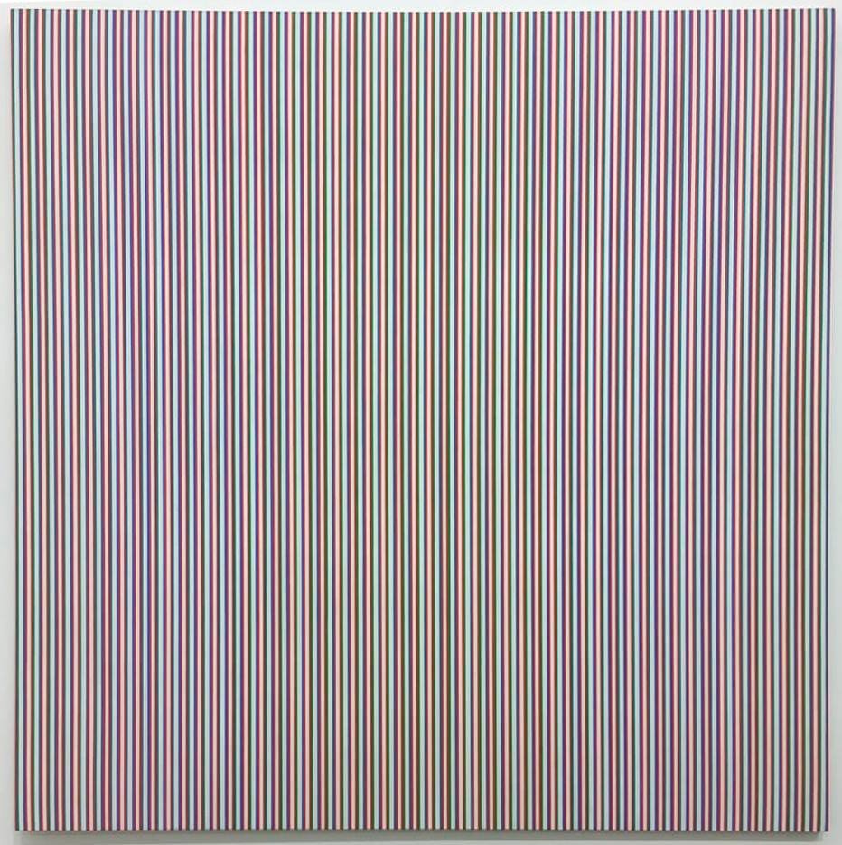
This show has 23 artworks from the 1960s and then hurtles into 2014-2018, with the exception of “Vapour 2.” The show elucidates strong parallels in Riley’s work. As you enter, to the right you see her masterpiece, “Late Morning 1,” 1967. Riley does series of works, as you will find, in all her investigations. This painting is composed of vertical stripes, alternating and varying reds and blues, which compress and relax the white areas so that a kind of morning light emanates from the center through color interaction and after-image. The painting breathes.
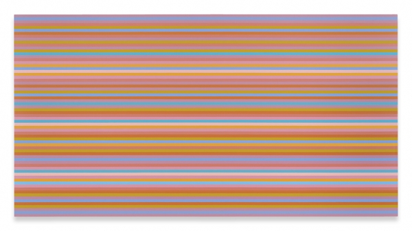
Also, in this room are three of her “Memories of Horizons.” The stripes are horizontal, painted in primarily warm, hot colors and some cools but overall warm/ hot sensations and they appear to undulate upward and downward. It’s wonderful to have three of these together to compare color movement and rhythm. Memories of Horizons is from a poem by Mallarmé, says Riley, “in which a long stream of consciousness tries to answer the question: what is the world?” These paintings are horizontal and so “Horizontal Vibration,” done in 1961, is placed on the opposite wall and is reflected in the “Memories.” In this very early work, Riley was first discovering how black and white could be modulated, shifted, and displaced to release energy from the painting surface. It recalls the afterglow of a sea surface or desert plain.
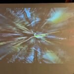
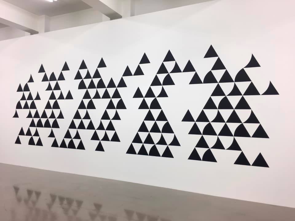
Moving into the next room we get the full reward of her years of intense painting in black and white. The surprise for me was “Quiver 3,” 2014, graphite and acrylic on the wall, about 150 inches in length (above). In this and “Divertimento,” 2016, acrylic on canvas, reminiscent of her beautiful early painting, “Tremor,” 1962, Riley paints what appear to be very simple units of triangles on a triangular grid but with slight dips and curves carved or added to the sides. In her drawings during this period, one can see the myriad ways she labors to shift the pacing between the units by turning and varying the individual shapes. Levels rise and fall, movement sparkles throughout the surface activating our senses. It’s important to her that the units do not stand out on their own but complete a harmonious unity.
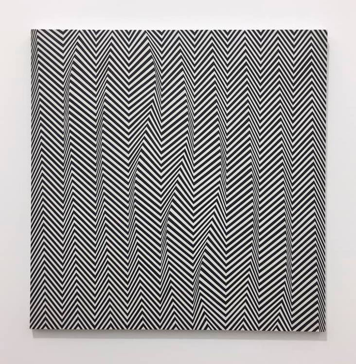
“Descending,” 1965, 36” x 36” (above) absolutely cracks and warps the surface and has many other wonderful color sensations. It was her early black and white painting that shot her name to fame rather violently, as some of you may know, when at the Responsive Eye Exhibition in New York, someone copied her painting “Current” on fabric and put it in a window display.
Later, in an interview with Andrew-Graham-Dixon, Riley describes the opening: “It was astonishing, about half the people there were wearing clothes based on my paintings and I tried to avoid having to talk to the people who were the most completely covered in me. There was one member of the MOMA council who was so furious that he said, ‘So you don’t like it? We’ll have you on the back of every matchbox in Japan!’…” She goes on to say that being in America was wonderful and the artists gave her much support, but it was tough for her to be taken seriously during this time. Since then, of course, she has received many accolades including the first woman to receive the Venice Biennale Major Painting Prize in 1968. Riley has also influenced so many painters through the decades. She and other Op painters working with perception and optical sequences changed the activity of picture plane. It was truly a new way to treat the planer surface. The paintings are visceral in this room so take them in slowly or at a glance. I believe gallery lights are a tad too bright for artwork in this room and are unnecessary. They are splendid on their own!
Upstairs we are greeted with some of her most recent work: “Measure for Measure.” We have number 23, 24 and 25, square 62-inch compositions and their accompanying smaller studies 25-inch squares. (Yes, there are numbers 1-22 somewhere). She painted a lot of these disc paintings. Also, in this room are two wall paintings with the disc units titled “Cosmos 2,” 2017 and “Untitled 2,” 2017-18. Her Measure for Measure painting series has been exhibited as early as 2016. Using lavender, green and orange at a very light saturation and mid-value, circles are painted in a grid in different compressions, sometimes tight, sometimes loose, sometimes discs go missing and the color sequences vary as well. They are calm and quite a contrast from the black and white paintings. The key to these it seems is what happens to the white areas which the colors live in: color irradiation. The white areas surrounding the discs have color after-effects, to be sure. There is also a kind of inner light that the discs seem to throw upon one another due to color contrast and interaction. I found these soothing but unpredictable. The “Untitled 2” is more minimal and daring. Very beautiful vector after-images set up and the open field is there. Riley has made use of discs in her early work when she started to introduce greys into her paintings. Riley has stated in several interviews that she is not concerned with the shape as signifying something. Also, she is interested in color-form, not colored forms. Two treasures from this early work are in the show: “Black to White Discs,” 70” square and “Study for Black to White Discs,” 35” square. In these paintings one can see Riley’s exquisite workmanship. The orientation of the composition is diamond shaped and the graduated tonal sequence of the discs move slowly across picture plane. I had to convince a gentleman that, yes, indeed they are painted. They are not prints.

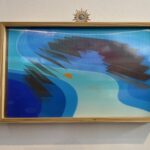
And we come full circle to her “Pink Landscape” painted in 1960 beside a really lovely “Vapour 2,” a striped painting done in 2009 which, coincidentally, has the same color combination as the disc paintings. Alas, we do not have any paintings from the late 80s and 90s: her Egyptian palette. I love those. But it’s an excellent show. Bridget Riley works toward nature. She paints intuitively. Her compositions have developed through her experienced and responsive eye. In her own words: “As a child one plays by lying on one’s back and filling one’s sight with the blue of the sky only to find the blue goes slowly towards grey. Your own eye produced the after-image of yellow-orange to compensate for the intensity of the blue. Color relationships in painting depend on the interactive character of colour; this is its essential nature.”
Go see it! Learn something.
The exhibition will be up Nov. 16, 2018 – Jan 26, 2019
Bridget Riley: Flashback, Hayward Publishing, 2009
Bridget Riley, Paintings 1982-1992, Introduction by Robert Kudielka, Printed in Germany, 1992
Bridget Riley by Maurice de Sausmarez, Studio Vista Limited, Great Britain, 1970
Bridget Riley, Dialogues on Art, Philip Wilson Publishers, London, 1995
Bridget Riley, Financial Times, Nov. 8, 2018